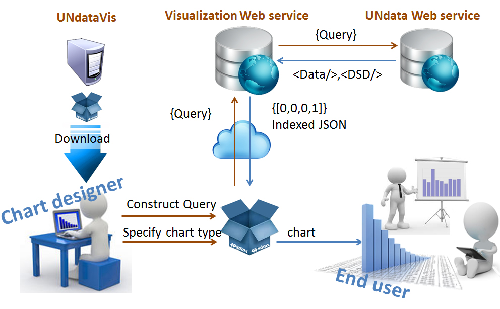
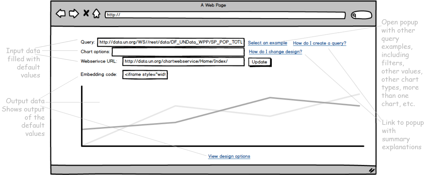
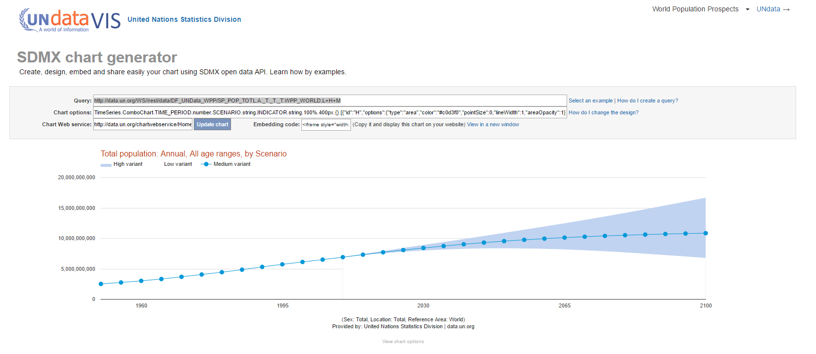
SDMX Visualization Package and SDMX Chart generator


Available at: http://data.un.org/UnDataVisualizations/chartGenerator/


Duties: UI/UX, Data Visualization, Front-end and Back-end development

Concepts & Methods: Scrum, Automatic visualization, Automatic design, Application Programming Interface (API), Web service, Interoperability

Tools & Tech: Google chart tools, Highcharts, D3, Javascript, Jquery, CSS, HTML, C#, .NET, MVC, SDMX, XSLT


Context


SDMX (Statistical Data and Metadata eXchange) is an international initiative that aims at standardising and modernising the mechanisms and processes for the exchange of statistical data and metadata among international organisations and their member countries. It is sponsored by seven international organisations including Eurostat (Statistical Office of the European Union) and the United Nations Statistical Division. https://sdmx.org/?page_id=2561

UNdata has an API that allows end-user developers to return data in SDMX-XML format. The XML is not the standard for newest visualization toolkits.


How can we provide data analysis tools
with SDMX for the information producer?

Initial Solution


In order to facilliate chart generation with SDMX data, we created the SDMX visualization package, a javascript API to generate visualizations with SDMX data, packing the UNdata API to the client level, in other words, to the front-end development. We have faced some challenges such as few tools for SDMX-JSON available yet and we had to implement customs transformations, converting SDMX-XML to SDMX-JSON.

Target group


Chart designer/statistician with background in front-end development.

SDMX Visualization Package Architecture


SDMX Visualization Package Result


Visualization in the SDMX Visualization Package are automatically generated with the SDMX-JSON data, setting observations and dimensions into charts marks according to system's knowledge of the selected data and efficient visualizations. The designer can still change this values through parameters in chart functions.

Example of generated chart


SDMX Visualization Package Result


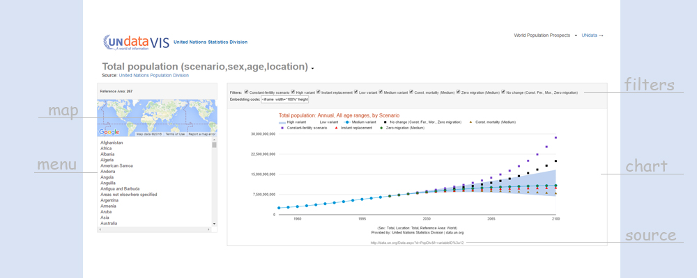
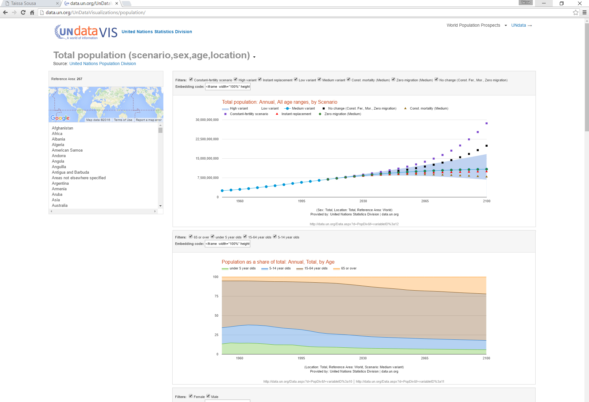
Besides the chart pallete of common charts (line, area, column, bars, map, table,...), the API comprises interactive objects for the interface such as menu, map and filters.

Example of interface created with SDMX Visualization Package


SDMX Visualization Package Result


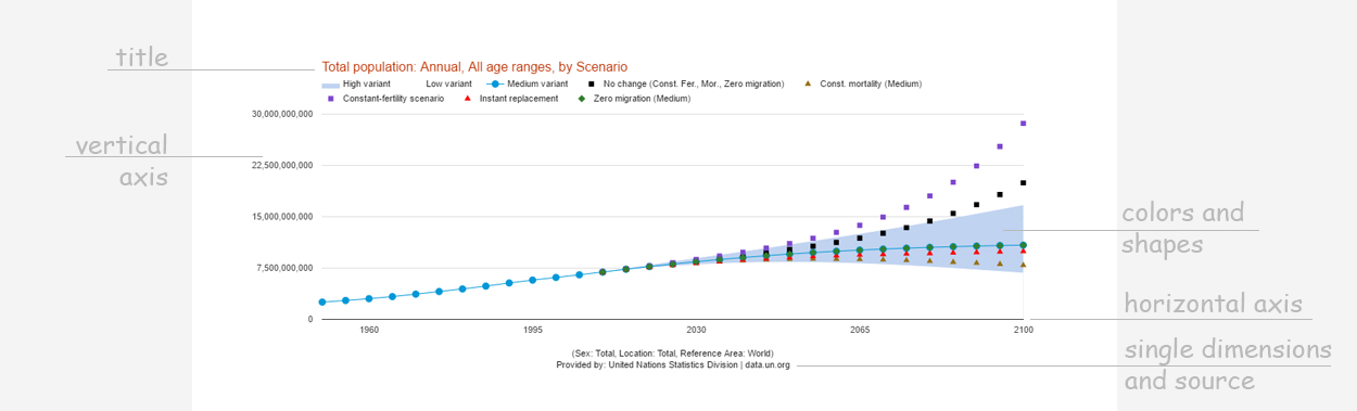
Other HCI adopted solution was the automatic chart design. A design palette set colors and shapes according to the dimension at the color mark. The automatic design facilitates creation of different charts, helping in end-user memory and interpretation.

Example of design palette for the World Population Prospect


Interface for chart construction - Syntax Example


var obj = { serviceUrl: yourWebservice, query:yourQuery}
var defaultValues = {}
var connection = new dataConnection(obj, defaultValues)
connection.getData(callback)
function callback(data) { 
	var series = data.createDataToTimeSeries(container, {})	
	chartObj= new createChart(series, "htmlContainer", "", "lineChart", {})
}
			

New context


Simultaneouly to the development of the SDMX visualization package, Eurostat had launch SDMX Restful API, making possible quering data through the URL. The SDMX browser for restful query was not available yet.

Thus, we saw an opportunity to improve the interface bringing charts to a higher level, the URL.

New Solution


We created a webservice and its client, the chart generator. The main idea is to send a query and get an efficient chart. Thus, the chart generator encodes three parameters, the query, the design options (optional) and the webservice URL. It returns the chart, design options and the code to include it in a webpage.

The SDMX documentation is extensive, so we included several examples allowing learning to query through abductive reasoning. As the chart generator interface returns the design options, user can learn by modifying it and observing the visual feedback.


Target group


Chart designer with background in SDMX REST query.

SDMX chart generator Wireframe


SDMX chart generator Interface


User Evaluation Results


We verified the need to include examples from other databases in the interface. The toggle button that allows user to get the default design options must be fixed because it is hard to copy chart options. Some users could copy it by selecting through the end and leaving the first letter unselected.

Implementation in UNdataVIS with World Population Prospects indicators

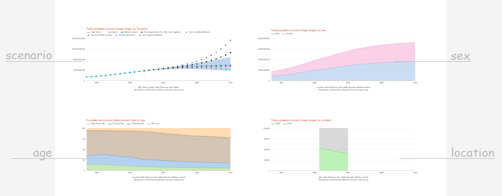
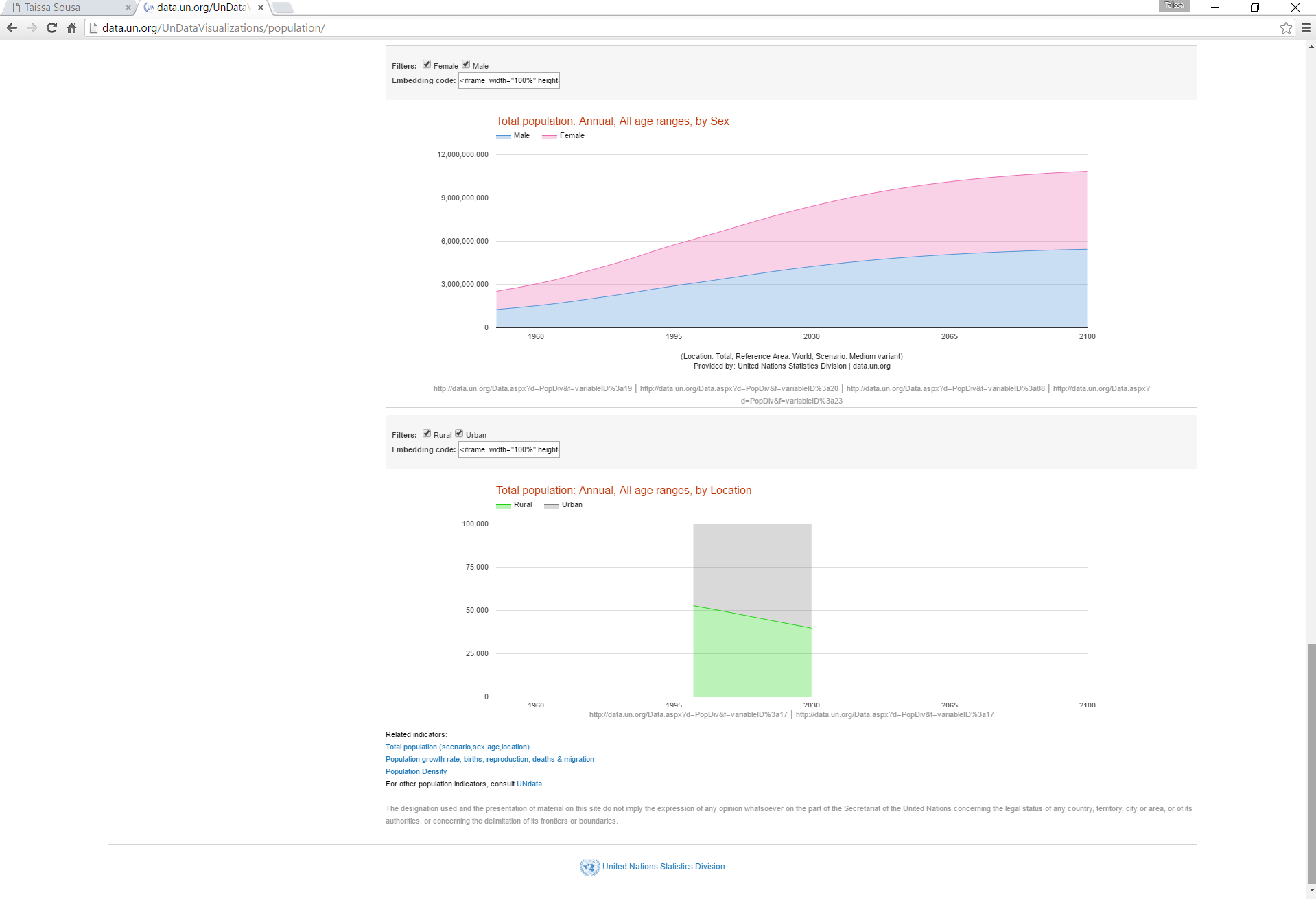
Time series for Total Population by scenario, age, sex and situation. It includes, charts, menu, map, filters and embedding code.

Implementation in UNdataVIS with World Population Prospects indicators

Population density

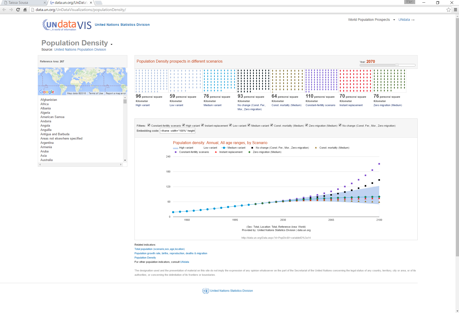
In this visualization, besides the time series, we included a cross sectional visualization created with html, css and javascript. This one is not included in the SDMX package.

Implementation in UNdataVIS with World Population Prospects indicators

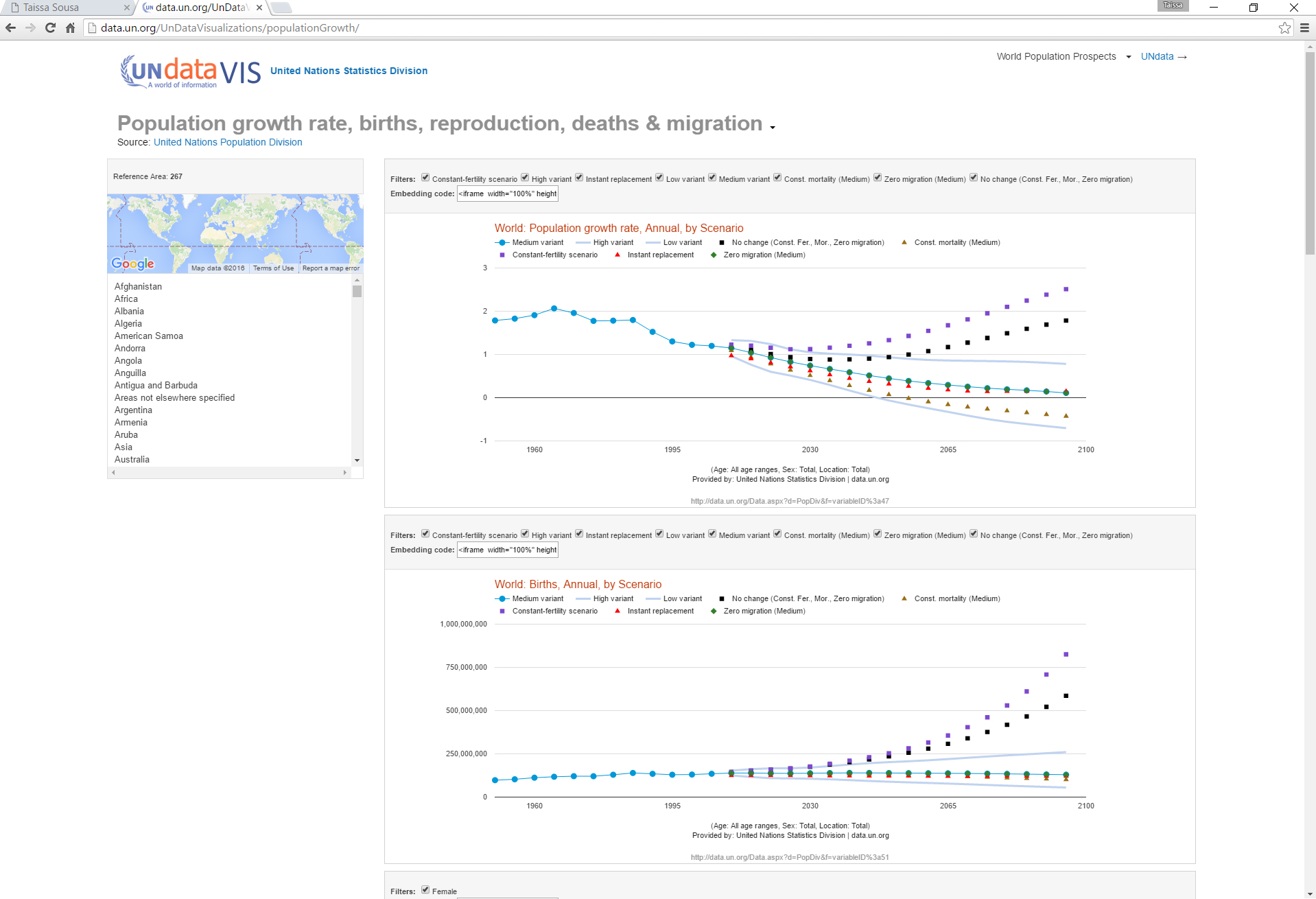
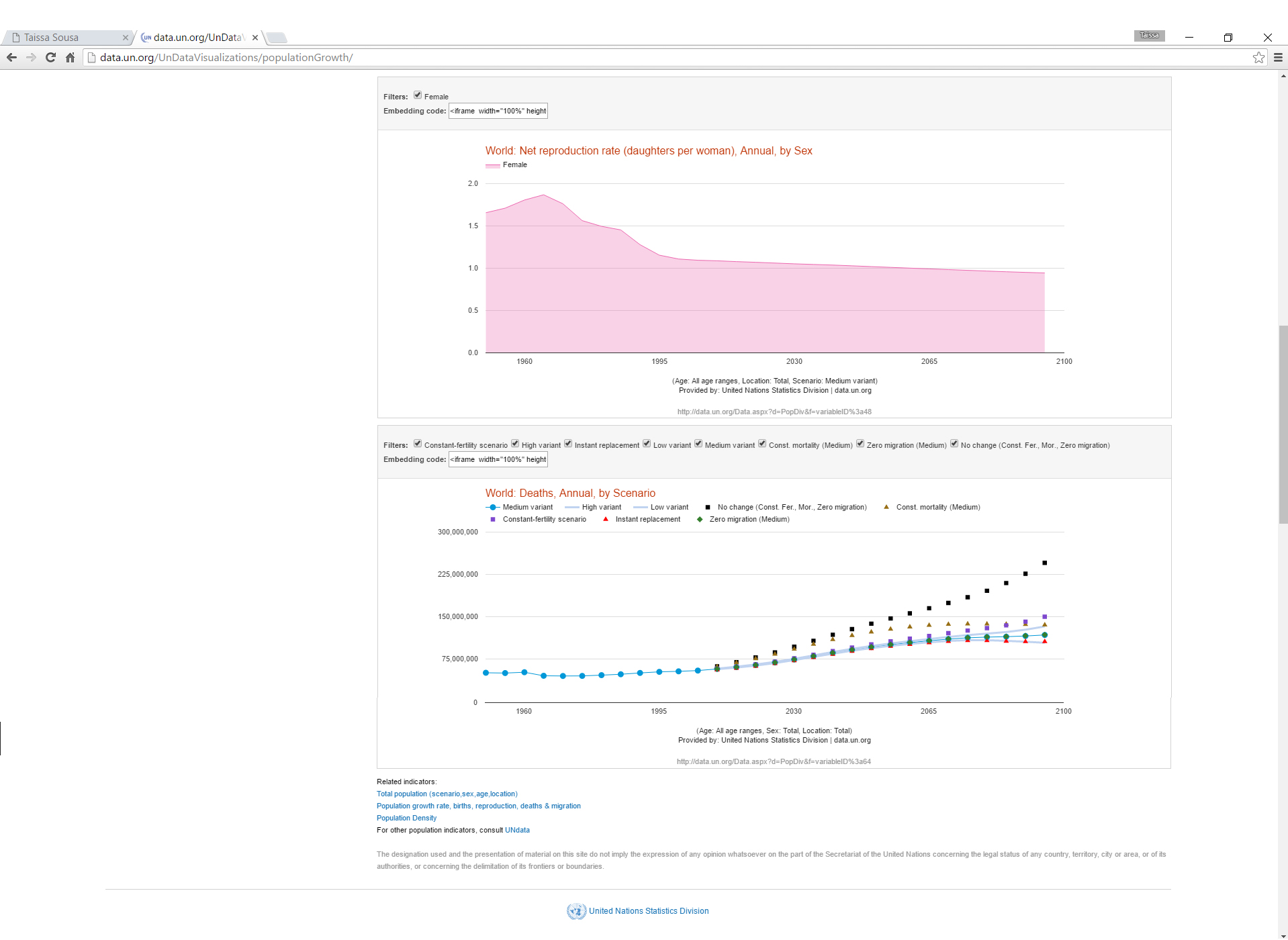
Time series for Population Growth rate. It includes, charts, menu, map, filters and embedding code.

Other ideas


Modify the chart generator to include labels for the design options.

Include more charts in the pallete of the SDMX visualization package.

Implement other databases.

Thank you

Taissa Abdalla Filgueiras de Sousa

taissa.sousa@gmail.com


Now, visit the chart generator and Population Visualizations.


Back to top